Wednesday, December 21, 2011

Living Room: The Bombe Chest


I have had a nearly 20 year fascination with bombe chests.  I love the curvy feminine lines and the incredible details.

Well, when I moved into this spot, my entertainment center pretty much fell apart on me. Partly because I am probably the only person in this nation that doesn't own a flat screen TV! And because of that, the weight of the TV pretty much crushed the soul out of my TV stand, causing it to buckle in the middle, the legs to become all wobbly. It was like an old lady. Poor thing. I had to send it to the retirement home.

So my family and I settled into our new digs and our Jurassic TV went directly onto the floor. Everyday it looked at me begging me to find a lovely place for it to sit. I looked at it and thought to myself, "If you weren't such a great TV, I would trade you in for a sexier model, but I kinda like you."

Since placing my TV on a diet wasn't a possibility, I set out to find a new home for her. What I found was that the TV stands and entertainment centers sold today are mainly created for the new and sexy flat screens! AND unless I was willing to shell out over $1,000, I was bound to settle for a cheap particle board stand that would eventually buckle under the weight of my beloved.


I needed something made out of solid wood. I needed it to have a place to discreetly hide my DVDs and CDs and I wanted it to be a good looking piece of furniture that would go well with my City Girl Chic vibe but still be classic enough to stand the test of time. Enter the bombe chest. It has all the right elements and goes well with the subtle feminine vibe I am trying to convey. It is sensuous with it's curving lines without being overly girly or frilly.


Bombe chests were first introduced during the French Regency Period. Bombe is a French term for any rounded or convex piece of furniture. Sometimes spelled "bombay", but it is not refer to Bombay, India. During the reign of Louis XV, French cabinetmakers began to abandon the classic styling of furniture loved by King Louis XIV, who placed strict limitations on how furniture may be designed. Master craftsman were finally able to express themselves and furniture masterpieces began to emerge. Many of these pieces had curved or bowed shapes. It was often lacquered with chinnoiserie, or Chinese inspired designs, such as flowers, exotic birds, dragons and tigers never before seen on furniture.


How much do you love that this piece of furniture was born out of a need to express oneself creatively following a repressive state of being? This is right up my alley and perfect for My Renovated Life.

Today's bombe chests are a bit more diverse, and traditionally have Queen Anne style Legs (which is exactly what my table desk has), and ornamental hardware. Many people use them as an accent piece to their entryway, and perhaps I will too as my living quarters change. I do long for a place large enough to actually have an entryway or foyer. But for my small apartment, I was on the hunt for a dark walnut finish, no chinnoiserie and minimal ornamentation and hardware. The most fun part of this search is that it is nearly impossible to find two chests that are the same. Like the snowflakes of chests.


I am REALLY hoping to find the perfect piece. I want a classic piece that my family can treasure for years to come. And I need a new home for my television that will fit right in with this new design I am installing in my living room/workspace. Wish me luck.

What do you think of the bombe chest? If you have one, I'd love to know how you use it and how it's styled!

Tuesday, December 13, 2011

Renovating My Body: 30-Day Raw Food Challenge


If you have been following My Renovated Life, you have had an opportunity to see that I am not just a FAB event planner. You actually have been able to peek inside my home and see the transformation I am making to my humble abode. But the purpose of this blog is to not only journal the renovation of my living and work spaces, but also the house that I carry with me everyday - my mind and my body.

I spent the majority of my life at a whopping 95 pounds. However, over the last three years I have gained nearly 40 pounds. Although some may look at me and my 135 pound frame and think, "Oh you look great! A little weight is good for you!" I look at myself and can't believe what I see. No matter how you slice it 40 pounds is a lot of weight gain for anyone. And when you are used to your body looking a certain way and then it no longer does, it's disappointing. It's not about what people say when they look at you. It's about how you feel when you look at yourself.


Well, when I look at myself, I am NOT happy. AT ALL. Further, I recently experienced a very scary medical condition with my pancreas and the consumption of bad fat. So, I decided to go on a 30-day raw food diet during the month of January beginning the day after Christmas. I have no idea if I will make it for the entire 30 days but I damn sure am going to try. I need to be healthier, feel healthier and maybe lose at least 10 pounds.

I promised you a peek inside my life and I meant it! I am nervous about this and scared to do it. I will need to exercise which is something I have never really done much of. I have a feeling I will try to wimp out and give up. I know I will crave cooked foods and meats and iced tea! I will probably also go through a few things emotionally and physically as I adjust but I am really praying for an increase in energy, better sleep at night and an overall good feeling about my body, how it looks and how it feels.

Just after Christmas, I plan to share a photo of how I used to look when I was a Skinny Minnie and how I look currently when I put on a tight fitting dress. You are welcome to follow along as I chop and blend and chew my way to a healthier me for the start of 2012.

xoxo - tami

Tuesday, December 6, 2011

Workspace: Spray Painting My Desk


I have really grown to love Craigslist. It is a cornucopia of unwanted items. Every now and then you come across an unusual and perfect item. And that is exactly what happened when I found my table desk.


I needed a desk that could fit into the little workspace nook that I painted in my living room. And I wanted something that had enough surface for my laptop and a few desk accessories. I didn't care for drawers and it had to be made out of wood. I wanted something that could be painted white so it would really stand out and pop against the chocolate swirl paint that I added to my workspace.


So the hunt on Craigslist began. I had my eyes out for a table desk and that is when I found this beauty. It was only $25 and it was being sold very close to my home. If you have ever lived in or been to expansive LA, you will understand that proximity can make or break a good deal!


It was perfect. It had curvy legs in the Queen Anne style, some unique carvings on the legs and was being sold as an illusion table. It has the unique ability to look as it were coming out of the wall.


I brought this baby home, decided saw that it needed additional sanding before I could paint it white. So, what does a girl do? She heads out to visit her favorite DIY friend, Home Depot!


This was shaping up to be another inexpensive project. Between the actual desk and the supplies, this total came to $42.86. Not bad!


First things first, I needed to protect my area with a drop cloth. Then I sanded the surface to remove any polyurethane and to provide the paint something to grab once applied. Once I finished sanding, I used a tack cloth to remove any excess sand and sawdust. This is the best way to rid of any debris and provide your surface with a smooth finish for painting.


Then I needed to repair a split in the leg with wooden filler and allow it to set for at least 24 hours. Afterwards, I sanded it down to give it a smooth finish.


To ensure a successful painting job that resulted in a durable finish, the table desk was then covered with a layer of Rust-Oleum Primer. Now the table desk was ready for it's first coat of paint. I used a can of Rust-Oleum Ultra Cover spray paint. Be sure you are wearing a mask to protect you while you prime and paint your furniture.


I ended up putting four coats of paint before I was satisfied with the coverage. I love how the details stood out once I painted it white. And it looks really good in the space. As you can see below, there seems to be a little variation in shade on the top, but that simply the light bouncing off of the wood grain, creating shadows.

NOTE: In hindsight, I probably will not spray paint again. It was very messy and the toxins in the air were way too strong.


I am really starting to love this area so much! I can't wait to accessorize and add some lighting! Perhaps then my photos will come out a little better!


So...what do you think?


xoxo, tami

Tuesday, November 29, 2011

Workspace: Painting the Walls


Welcome back! Today we are going to paint my wonderful little workspace. I am beyond excited to get started. So, as you may recall this little area was a former closet. It is in my living room area but since we rarely use the television in our home, it should be a perfect place for me to turn my back to the activity of my home and focus on the work at hand. If this is your first visit and you want to know more about this process, feel free to review the posts on my Color Palette and Paint 101.


OK, are you ready? Let's get this party started!

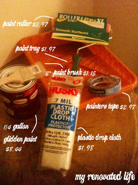
Materials {found at Home Depot}:

Pour your paint into the paint tray.Only fill your tray about half full because the space on the top with the ridges is to squeeze the excess paint out of your rollers and brushes.

PREP TIME:
As I stated before, I am painting inside of a former closet. However, if I were painting a room, I would need to remove the plates from all light switches and electrical outlets. I would also need to remove any lighting fixtures.


1. DUSTING - You want to be sure the walls are free from dust particles and cobwebs. Anything remaining on your walls will inevitably be painted over, which may lead to unsightly bumps and creases in your paint job. Because I live in Southern California, we always have spiders. And with spiders come cobwebs, therefore, I purchased this duster to wipe away the cobwebs that seem to appear in the corners of my home all of the time.


2. TAPING - Next is taping. This can sometimes be the most tedious of jobs because you want to be sure your taping is straight and also well adhered to the wall and border you are protecting so that your paint doesn't leak through. I generally work with strips that are no longer than 12-inches in length because they are easier to line up properly. Be sure to cover all borders and tape the corners on the wall you will not be painting.

PAINTING THE WALLS:


First things first, place your drop cloth on the floor. Trust me, no matter how careful you are, it is very likely you will drop paint on the floor. It happens.


I very rarely paint the ceiling but if I were to do so, it would be the first task. Because I am using such a dark colored paint coupled with the fact that this area gets very little light, I chose to keep the ceiling the white color it currently is. When I place my lighting options in this area, I want the light to reflect back down to illuminate this space. {Trust me, honey, it needs all the help it can get}.

If you are painting the ceiling, you pretty much go about it the same way as painting the walls except you will need to purchase an extension pole to add to your paint roller and a two-step ladder for the borders. Unless you are Shaq, you will need the ladder and the extension pole. How else will you reach it?


3. BORDERS - You want to start out by painting the borders using either a brush or an edger. I prefer a brush because I am very particular about coverage and with a brush I can get in there and make sure it is completely colored in.


4. THE W - Using your paint roller, roll out a "W" shape about 3-4 feet wide. This is the basic movement you will continue to use as you paint your wall. When you have completely painted a 4-foot square, move onto the next area and repeat. Continue on in this manner until you have full coverage that bleeds into your painted borders. Because I am painting with a very dark and saturated flat paint, I didn't need more than one coat. However, if you are painting a light color over a darker color, or you are painting with a sheen, you will more than likely need two coats of paint. This will ensure more coverage, less streaking and a more durable professional looking paint job.

NOTE: Be careful not to overload your roller with too much paint. Not only will it drip and run all over the place, but it can also clump up if your paint is fast drying. If you get any runs or clumps, be sure to wipe it immediately with a wet rag. 

5. TAPE REMOVAL - Once your paint is nearly dry (not all the way dry), you can pull off the tape. Did your paint bleed over? No worries, you can simply touch up your trim or borders with a bit of paint in your walls original color.


VOILA!!!
You are done! Or in this case, I am done! It's dark, but I love it. Once I add the lighting to this space, it will be just perfect. It really does make a difference compared to the before photos, doesn't it? Hard to tell in my grainy iPhone pics with poor lighting, but it is a delicious chocolate-y color using a flat paint. Wait until you see what else I have planned for this area!

xoxo ~tami

Monday, November 21, 2011

Paint and Paint Supplies: The Basics

There is so much to consider when you choose to paint walls. I prefer to go to sources that seems to have the most knowledgeable staff and the widest range of choices when I am out of my element. As such, over the years Home Depot has become my friend. When you have no idea what you are doing, or even if you have some idea, the staff there knows their stuff and generally can point you in the right direction.

I decided to paint the workspace that beautiful Chocolate Swirl color by Behr so I paid my friend a visit to pick up a few things.

{excuse the grainy iPhone photo quality. this is why I really need to get more lighting options and a good camera}

Basic paint tools for this mini makeover came to a whopping $22.48 before taxes! WOOT WOOT Seriously, paint is probably the least expensive way to make a big impact in a room EVER. I have never lived anywhere that I didn't paint a room or a wall or a corner. 

In this case, since I am only painting a former closet, I won't need much paint which is why I selected a 1/4 gallon can. However, if you are painting a room, you could very well go through two or more cans, depending on the size of the room and the number of coats needed. Please be sure to consult with the Home Depot staff if you have any doubts. 

TIP: I would rather see you buy less cans of paint than you need than more than you need. Why? Because if you buy too many gallons and they are mixed with colors, you cannot return them. On the other hand, if you run out of paint, you can always return to Home Depot for a gallon or two more. The color can easily be matched by taking the lid from any used can. It has the code that the paint technician needs to properly mix and match your color.

As much as I love the large selection at Home Depot, it can certainly be overwhelming. The paint section is replete with all kinds of paint types. Among those are various types of shine (or lack of shine). How do you know which one to choose?

Gloss - Gloss is primarily used for trim or cabinetry or in bathrooms or kitchen areas.  The glossy, shiny surface provides the best surface for easy clean-up.

Semi-gloss - If you prefer a less shiny look with the same ease for clean up, you may prefer semi-gloss. This sheen is great for areas that will see a lot of moisture and condensation such as a bathroom or kitchen. 

Satin - The cool thing about satin is that it is just as durable as semi-gloss but has less sheen. When you have imperfections on your walls, such as seams and bumps, satin does a great job at highlighting those areas so they are less noticeable.

Eggshell - Want low sheen without going flat? Eggshell is your friend. It is also great for walls with imperfections and bumps.It has an almost matte or flat appearance and is very smooth. It is not very easy to clean but with some elbow grease, fairs a bit better than flat.

Flat - Flat is chalky and hard to clean but a perfect choice when you want little to no shiny reflection or if you are going for a chalkboard paint type of finish. This type of paint is especially good for ceilings.

As for which brand works best, it truly depends on what room you are painting and what your goals are. Again, I would consult with a Home Depot staff member. 

Please note that ANY brand can be made into any color from any paint swatch regardless of the brand who developed the paint swatch.  For example, I chose a can of Glidden paint but had it mixed in the yummy Chocolate Swirl color that Behr offered. I tried this once at a Orchard Supply Hardware and they weren't able to accomodate my request. Hence, my return and continued love affair with Home Depot. They can mix any color with any brand. They can even match a swatch of fabric if you prefer. LOVE THEM!

So that's my mini lesson on types of paint. I hope it helps you find the right paint for your paint job. Next time I will share my painting process and how I put the materials purchased above to good use.

xoxo ~tami

Tuesday, November 15, 2011

Discovering My Workspace

I have this really unique area in my living room that apparently used to be a closet once upon a time. I have no idea what prompted the building owner to remove the closet door and allow this to be an extension of the living room, but I am sorta glad it is.


Because we live in a very old apartment building, the rooms are not exactly big. So, it was imperative that I find a place to have my home office/workspace. I absolutely will not use my dining table or sofa or bed as a work area. I need to be able to turn my back on the activity of the home and focus. If I can't have a room for an office than I need a space for it.


I initially considered finding a way to create a space in my bedroom but I don't think I would sleep well in there knowing my work is within eyesight. So I nixed that idea.


I kept looking at this former closet space, thinking perhaps I could build a wall unit in there and house an entertainment center with a television and sound system and then I remembered that we don't really watch much TV in our home. (yes, I actually had to make myself remember that!) With the advent of laptops and iPads, it is rare you will see anyone watching the actual television and when we do turn on something via Netflix or Hulu or DVD, each of us generally watches our own thing on our own device with our own headphones on. As such, my home is generally a very quiet place.

{I have special plans for that table coming up in a future post. Yum Yum Kitty just had to get into the shot...she's such a camera whore}

That is when I decided that this former closet would make a perfect workspace, politely tucked a little bit away from the general living room area so that I can focus on the work at hand but not enough so that I am in a separate room. As you can see, my living room is a very dark room. Even on the sunniest days we beg the sunlight to please grace us with it's beams. This is in large part due to the massive brick building merely a few feet away from our building which happens to block most of the sunlight we could even imagine getting. This means lots of light needs to be brought in.


Sure there is a ceiling fan in the middle of the room, unusually large for the space, but it doesn't give off the type of light I would like for this area. And it doesn't do much to brighten up the workspace. Therefore, it is a REAL issue to brighten up this space as much as possible. And as you know, my color palette isn't exactly bright and sunny so I will need to be a bit creative.


Nevertheless, my first project has begun. Can't wait to show you what I have planned for this little corner that I can call my own.

xoxo

Monday, November 7, 2011

Living Room: The Chosen Color Palette

Thanks to everyone who offered their thoughts via Twitter on what color palette you like best. It was actually split down the middle. Some of you liked the aubergine and silver and some of you liked the deep tribal red. So the final decision still fell solely on me! So much for relying on a poll to help me decide! HA! If you have no idea what I am talking about, check out the previous post HERE to discover to catch up and to take a peek at what my sofa looks like.

It was a hard decision but I finally made it. I am going with the aubergine and silver chic city girl look! YAY!

I really love the deep red tribal look but I am the type of person who likes to go against the grain and this look is seriously in so many homes. Now that my two eldest kids are adult, I figured it was time to have a sexier look to my home.

Just look at these paint samples I snagged from Home Depot. The brown is called Chocolate Swirl by Behr and the aubergine is called Delicious Plum by Glidden. Just the names alone make my mouth water!


I was very concerned about the living room looking too cold and unwelcoming but being that my living room area is so dark and gets very little sunlight, the coldness of the look can easily be addressed by adding lots of lighting options, interesting eye candy and plenty of plush textiles.

Both my sofa and my hardwood floors are brown. I think the aubergine will look delicious against this and the silver elements will add some sexiness to the space.

I haven't brought my sofa home yet so with the room empty, I have been able to take my time to visualize how I want everything to look. Here are some decor elements I am considering:


I am super excited to get started. So, I am dying to know what you think! And if you know of any other really cool items that you think would be perfect for this design, please share, I would love to see what you come up with. After all, two minds (or more) are better than one!

xoxo tami

Wednesday, November 2, 2011

Living Room: Deciding on a Color Palette

I spent a great deal of time at Z Gallerie, Pottery Barn and Crate and Barrel recently trying to decide on a color palette for my new living room. I have this chocolate brown leather sectional from IKEA that is about 5 years old. It's actually a very nice sofa and I quite enjoy the chaise lounge part of it, but it doesn't make for the most comfy place to cuddle and it is very contemporary in design. I would like to replace it for something a bit softer but I am not quite ready to make that type of  financial investment. Therefore it is imperative that I choose a look and color scheme that will go well with it.

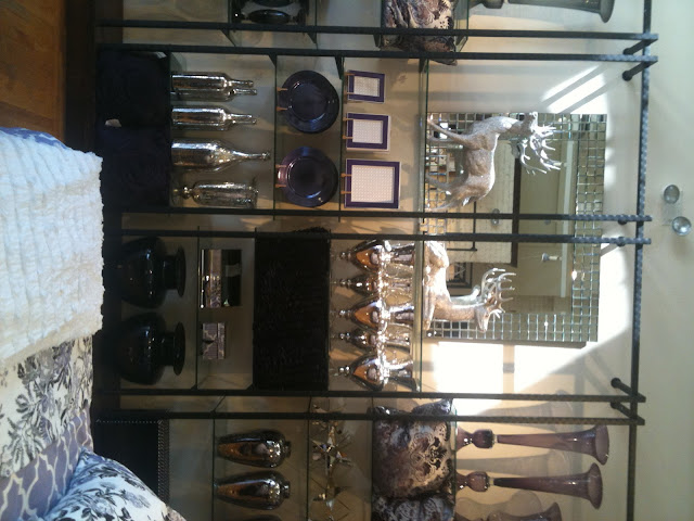
It came down to deep red and neutrals with a tribal feel or aubergine and silver for a city chic look. So the hunt began. Here are some photos I snapped while I was out and about to help me with ideas and inspiration.


{Photos by Yours Truly}

Mind you my living room is poorly lit and unless I go with sunny yellow or all white the chances are I will have to buy plenty of lighting options to brighten the place up.


So what do you think? Aubergine City Girl or Deep Tribal Red?

Monday, October 31, 2011

Welcome to My Renovated Life


ren·o·vate
To restore to a former better state; give new life or energy to; reanimate; repair, quicken, vivify, revivify

The year 2011 has truly been a year of purging the old and welcoming in the new. My family and I have experienced many changes that have positioned us to grow and elevate in ways we have been praying for. We recently joked about how for years we felt the recession before the recession actually began!


Among many of the changes that have come, our most recent change was a relocation from an apartment circa 1960s in West Los Angeles into a really beautiful and historic apartment towards Larchmont and Koreatown. Our new neighborhood was one of the first comprehensively planned communities in Los Angeles designed for upper and middle-income families. As I walked through the streets the other day, I was excited to find so many hidden treasures, cafes, bistros and gorgeous architectural elements around every turn. 

Our apartment building was constructed in 1929 with design elements in the famous Art Deco style. This architectural style began in Paris in the 1920s and is marked by the use of materials such as aluminum, stainless steel, lacquer, chrome and inlaid wood, as well as exotic materials such as sharkeskin and zebra skin. The use of stepped forms and geometric curves, chevron patterns, fountains and the sunburst motif were quite typical. At it's best, art deco represented elegance, glamour, functionality and modernism.

{lobby of a building in our new neighborhood showing the art deco elements found in our building and others like it}

The details in our apartment is what makes living in a historic building so fun. Our building is made of brick, which is not the typical building material used in Southern California where most buildings are reminiscent of the Spanish Revival period with it's smooth plaster and red-tiled roofs.  Instead, we live in a building that reminds me of apartment living in New York City. We have beautifully maintained original hardwood floors and high ceilings with a small kitchen and bathroom. It stay nice and cool in the summers and will retain a decent amount of heat in the winter. We are thrilled.


This type of apartment is right up my alley. I am not big on living in these new pre-fabricated homes built on tracts. Historic homes have personality, architectural interest, nooks and crannies that today's constructed homes lack unless you are designing your dream home from the ground up. Historic buildings definitely come with challenges... like insulation issues, creaky floors and lack of air conditioning. However, I say bundle up if you are cold... the creaks are the homes way of telling you it's been loved... and thankfully living in Los Angeles rarely requires the use of air conditioning. 


The first several weeks that I lived in this space, I did so without my furniture. I placed everything I owned in storage and have camped out on an air mattress as I decided what I wanted to do with our new living quarters, what items I would keep in storage and what can be incorporated into our new home. I have been collecting a few ideas that I plan to turn into projects and a few forgotten and discarded items that I plan to bring back to life. As they say, one man's trash is another man's treasure. Sometimes people have no idea what they are throwing away. In addition, I will journal about my second-hand furniture shopping and finds.


I created this blog as a place to share my journey as I paint, design and decorate our new digs. And I wanted to allow you an opportunity to have a peek inside my real life. Perhaps you will follow along. Perhaps you will not. Either way I am journaling my process because it is therapeutic for me and it helps me to look back at what I started with so that I can truly appreciate and always have a heart of thanksgiving for where I am in my current state.

I truly believe in surrounding yourself with what you love. I am the type of person who will take my time finding that perfect chair, that perfect piece of art work or that perfect accessory in order to feel happy and satisfied with my home. I am not just creating a living space...I am making my house a home (or my apartment, in this case).


I have plans... lots and lots of cool and amazing plans to share with you. I invite you to journey with me as I refurbish old furniture, decide on wall coverings, select art work,take on DIY projects and create the home that my family can settle into and enjoy for the next year or two.


Welcome to my renovated life!